
Affordable Art Fair Milan 2019
- Carmen Frigerio

- 30. Jan. 2019
- 5 Min. Lesezeit
Aktualisiert: 1. Feb. 2019
A wide and rich art fair, where the visitor could "lose himself in art", or -even better- "dive into art", how not to drown it ? We can not give you the answer, but we can tell you which artworks we liked the most among all the ones that were exhibited in this "big art sea".
Affordable Art Fair returned to Milan under the motto “Lose yourself in Art”. Inside the space of Super Studio Più, located in the lively and creative “Tortona” area, the public was shown thousands of works of art, galleries and artists from all around the world. Since its foundation, Affordable Art Fair has exposed artworks, the price of which can reach a maximum of 6,000 €. Its founder, Will Ramsey, first opened an art gallery in London (in 1996) with the goal of opening contemporary art to a wider public, making it accessible to all and demolishing the sense of impossibility to read and interpret it. Three years after the opening of the art gallery, and after its success, Ramsey decided to inaugurate Affordable Art Fair London, whose huge success convinced him to export the fair’s concept to other European and extra-European cities, such as Amsterdam, Bristol, Brussels, New York, Milan, Singapore, Stockholm, Hamburg, Maastricht and Hong Kong. Established in London in 1999, the art Fair counted more than 2 million visitors over the last ten years. These days in Milan, the visitors had the chance to “lose themselves” among national and international galleries, but also to visit a “virtual Art Fair”, thank to the VR technology and participate in the many events which were on the calendar.
Although the fair was huge, and sometimes it was difficult to avoid feeling confused by so many artworks, we selected for you three art galleries, which were in our opinion the most interesting ones.
Bomnamu Art – South Korea

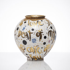
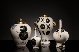

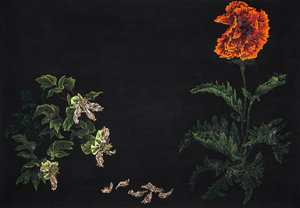

Photo courtesy Bomnamu Art
The gallery proposed different artworks where the antique and the contemporary merged, and for this reason its space could not blend in. Artist Jun Young Kang, in particular, chooses to reinterpret the ancient oriental vases by inserting contemporary elements in those latters. In his ceramic vases, we find traditional techniques and patterns, such as the use of gold glaze, or “blue and white pottery” typical decorations (normally found in the Ming dynasty ceramics). These traditional elements are mixed with other ones, that are characterized by the artist’s energetic and turbulent style, which gives us the feeling of looking at a graffiti. The vase surface becomes a white paper where the artist leaves a contemporary mark, which combines street pop culture, internet culture, and even tattoos culture to ancient tradition. If in the past artisans expressed their creativity on everyday objects that they created for the noble dynasties, today artists moved their artistic expression to the skin, to the public walls or to phone/ computer’s screens. The vases of Jun Young Kang put an evidence on the inevitable and vital development of the arts. Across Jun Young Kang’s innovative ceramics were placed the paper works by the two other Korean artists Bo Mi Kim and Yusun Jung, whose approach is more linked and attached to the tradition in the use of the media, but whose artistic vision is rich of contemporary issues. Both Bo Mi Kim and Yusun Jung make us look at natural elements, through their poetical representation, in this way they challenge us to observe and reflect upon the beauty of nature which can be so powerful and fragile at the same time.
ESH Gallery – Italy


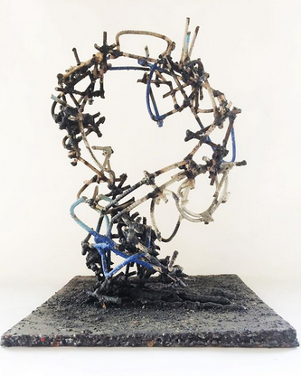
Photo courtesy ESH Gallery
The sober yet professional and well curated setting up of this gallery based in Milan was surely an aspect that could catch anyone’s eye. The works of art talked to each other and each of them was dedicated enough exhibition space in order to shine and appear at its best.
It was particularly the case of the two small bowls made by the artist Angela Mellor, above which a light was hanging, making all details of the porcelain's surface visible and giving to the viewer the possibility to admire them fully. The artist is able to mold the porcelain until it becomes so thin that it almost looks transparent, giving us the perception of holding a bowl which is made out of paper or lace.
On the first wall of the stand, ESH Gallery decided to show the minimal works by Giovanna Strada and the iron sculptures by Manuel Bonfanti, thus creating an impressive and interesting contrast, but still allowing the two artists to be in a dialogue. Although very different regarding the materials and the media they choose for their artistic research, both two artists explore the space and the forms in the space, through their work. On one hand, wall sculptures by Giovanna Strada investigate the relationship between essential shapes, such as the circle or the square, and the void: in her series “Spazio Latente” (“Latent Space”) the artist decides to integrate the wall in the artwork’s space, thus melting the immaterial with the material, putting them together and integrating one into the other.
On the other hand Bonfanti’s intricate sculptures reflect upon the space through a complicated intersection of lines and knots, which create different forms in the space and trace the outline of the void. While Giovanna Strada works with straight and pure lines and compact primary colors, Bonfanti chooses the roughness of iron, material which he uses to underline the opposition between the emptiness of the void and the heavy presence of the matter.
Gallery 40NL – The Netherlands


Photo courtesy Gallery40NL
This was a stand which decided to attract the visitor’s attention with delicate and clean forms, essential lines and balanced colors. Each work invited the visitor to take a look, in order to discover the details which could only be noticed when closer to the artwork.
The geometrical shapes of Eliza Kopec’s works enchant the beholder with their harmony and dancing rhythm. The three canvas exhibited at AAF were a hybrid between two and three-dimension; the artist uses in fact thin and tiny pieces of colorful paper and assembles them together in geometrical concentric circles, that remind to “cynetic art” for the illusion of movement they create in the beholder’s eyes. The works are pleasant to look at from far, but if observed closer, they would reveal smaller details which are even more interesting: each piece of paper enshrines different shiny colors that challenge the observers’ perception.
The Colourlightskin series by German artist Freddie Michael Soethout inevitably called the visitors’ attention, as his artworks (hung on the wall) presented various small color flecks “trapped” between the edges of the side by side glass strips; by combining the color with the glass, a dynamic effect is created, and this effect can be perceived even out of the corner of the eye and makes anyone turn in order to better analyse the artwork.
Gallery40NL attracted their curious visitors, with no need of exhibiting huge pretentious sculptures, but rather some delicate porcelain works by German sculptor Petra Benndorf. Her works make the beholder wonder what material they are made of; her sculptures look like shells that were found in the sea, or that belonged to some animal. The sculptures of the talented artist imitate nature and they have the great power of combining a delicate and very light material, such as porcelain, with patterns that evoke raw nature, thus creating an alienating perception in the viewer.
#affordableartfair #Milan #contemporaryart #artgallery #artfair #bomnamuart #ESHgallery
#Gallery40NL #loseyourselfinart


Kommentare